Skip To Content Privacy Page

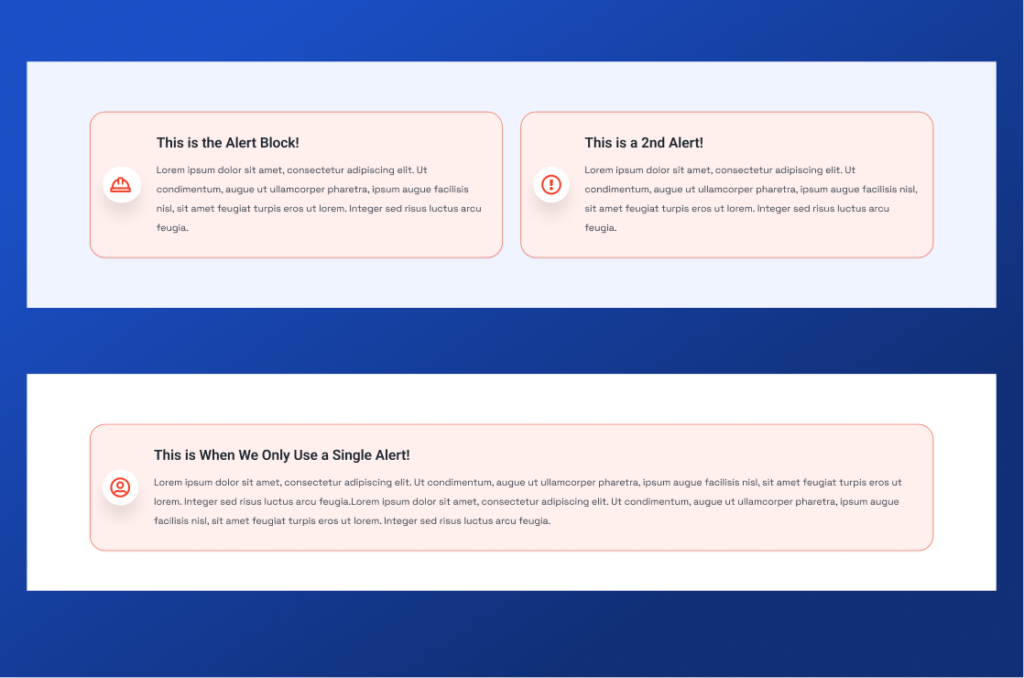
Travel Alert 2: High Passenger Volume During Labor Day Weekend.

Lorem ipsum dolor sit amet, consectetur adipiscing elit. Integer blandit nisl non ligula laoreet placerat nec ac mauris. Pellentesque ac nulla interdum, venenatis mauris quis, commodo tellus. Aenean iaculis nunc magna, in pharetra urna posuere et. Duis auctor nunc tellus, non consectetur est finibus nec. Proin quam leo, dapibus non imperdiet eu, vulputate vel est. Donec pretium est posuere vulputate sagittis. Fusce malesuada volutpat mauris, sed consequat tellus posuere ac. Suspendisse potenti. Cras ut blandit risus. Suspendisse sed auctor enim, vitae scelerisque velit. Donec eu sagittis erat, ac sagittis urna. Donec vel nisl non metus varius pellentesque ac et orci. Aenean at tempor tellus, ut pharetra erat.

Call To Action 2

Block Library

Accordion

Accordion

Style can be boxed or ghost. Layout can be center (intro text above accordions) or intro text left-accordions right. Accordions can be manual or pulled from the FAQ post type.

Learn More
Alert

Alert

Can be a single alert or two (side by side). Fields include: icon, title, and copy.

Learn More
Callout Banner

Callout Banner

Can be full width or within a container. Light or dark mode, eybrow text, title, copy, and optional ctas.

Learn More
Callout Banner Mini

Callout Banner Mini

Can be dark or light mode. Can be inside a container or full width. Title and 1, 2 or no CTAs.

Learn More
Card Document

Card Document

Pulls from the document post type. Title tag can be h2, h3, h4, or h5. Auto displays file type and file size.

Learn More
Card Event

Card Event

Integrated with Event Calendar Pro plugin. You can choose event categories to display and the max number of events to display at a given time.

Learn More
Card Expand

Card Expand

Each card contains an image, a link, and optional copy. The copy and link display on hover.

Learn More
Card Headline

Card Headline

Contains fields for a title, an excerpt (body copy) and a link which can be an internal or external link. Supports grid and slider layouts.

Learn More
Card Icon Horizontal

Card Icon Horizontal

Can be a boxed or ghost style. Can choose 1, 2, 3, 4 or auto columns. Can choose the Card Title tag (h2, h3, h4, h5, or h6) Can build cards out manually or select from page dropdown (auto pulls the icon associated with that page.

Learn More
Card Icon List

Card Icon List

Image left, Icon list right. Text left, Icon list right. Or text centered on top, image left and icon list right. Image aspect ratio can be changed. Can build icon cards manually or select pages.

Learn More
Card Icon Vertical

Card Icon Vertical

Cards icon can be boxed or ghost style. Alignment can be left or centered. Columns are customizable. Title tag (h2, h3, h4, h5, or h6 customizable. Cards can be built manually or by selecting pages. Supports grid and slider layouts.

Learn More
Card Image

Card Image

2, 3, 4 or auto columns. Style can be ghost or boxed. Alignment can be left or center. Title tag can be selected (h2, h3, h4 h5, h5) and cards can be built manually (image, title, copy, link) or pulled from pages (which pulls the title, page excerpt, and featured image of page). Supports grid and slider layouts.

Learn More
Card Image Background

Card Image Background

You can upload multiple images as a background and fields include a Title and link. There is no body copy that shows on hover. You can change Card Title Tag as well as columns. You cannot change image aspect ratio.

Learn More
Card Team

Card Team

You can choose between two different frontend options: Content on top of the image or below. All team individuals are managed at the post type level. You have an option to enable popup content or not and you can choose columns.

Learn More
Copy

Copy

The copy block is essentially a WYSIWYG, however, this block gives you the option for 1, 2, or 3 columns (which displays separate WYSIWYGs). Enable show more is also an option for long text (only works with 1 column).

Learn More
Dynamic Table

Dynamic Table

This custom table pulls from the meeting post type and is used primarily for government meeting and agendas documents (including filtering).

Learn More
Embed Script

Embed Script

this block allows for a single iframe / embed solution with the ability to customize the columns (8, 10 or 12). The Media Object block allows for an embed as well if you need text left, embed right or vice versa.

Learn More
Featured News

Featured News

Pulls from the posts/blog post type and allows you to either Manually select posts – choosing a primary featured post (left column) and multiple featured posts (right column). Or, you can simply choose ‘Most Recent’ and it will auto-update.

Learn More
Form Basic

Form Basic

This block pulls from forms created at the post type level. There are 3 layout options: copy left-form right | image left-form right | form centered.

Learn More
Form Media Object

Form Media Object

This block should be used when you have more intro text needed than what the Form Basic block allows for. Layout = intro text on top with image left (you can choose ratio) and form right. There is an optional WYSIWYG that places text beneath the image.

Learn More
Hero

Hero

Our basic hero block can be left or center aligned. Dark or light. Breadcrumbs can be shown (will dynamically populate). Title, body copy and 2 button options.

Learn More
Image Gallery

Image Gallery

Includes intro copy and image gallery (no limit to # of upload). You can choose how many images to show on the viewport – which will adjust the image size accordingly.

Learn More
Image Grid

Image Grid

Image grid is a basic image gallery where you can define the columns as well as image aspect ratio. All images are clickable and will open a lightbox.

Learn More
Intro

Intro

3 text layouts that can be used on top of a different block or by itself to provide important content.

Learn More
Logo Group

Logo Group

Two layouts: stacked in columns or as animated scroll. The component can be ghost or container style.

Learn More
Media Object

Media Object

This block supports: a single image (with control over aspect ratio), a video, an image gallery, or an embed script. The media can be either left or right.

Learn More
Media Object Full

Media Object Full

This block supports a background image with a block of text positioned left or right. This block also supports breadcrumbs, so can be used as a Hero. You cannot change the background color of the text block.

Learn More
Media Vertical

Media Vertical

This block supports an image (you can choose the aspect ratio) or a video.

Learn More
Multi Link Banner

Multi Link Banner

The multi link banner can be either inside a container or full width. The component itself cannot change from light to dark, but the background color can. Columns can be Auto, 2, 3 or 4.

Learn More
Scrolling Ticker Tape

Scrolling Ticker Tape

This block supports either images (favicon uploads) or you can select a Font Awesome icon. You must add 3 (identical or different) tickers to trigger the animation.

Learn More
Social

Social

The social block is similar to an image gallery, but it displays social icons and each image can be associated with a link (social link or otherwise). The aspect ratio is fixed as a square.

Learn More
Stats

Stats

Supports post type or manual stats. Columns will vary based on # of stats. You can change the header class of the stat #. Stats style can be either ghost or boxed. Card background color can be light gray or white.

Learn More
Stats Media

Stats Media

Stats can be built manually or as a post type. The style of stats can be ghost or boxed and you can change the header style of the stats. You can choose a container for the block. You can display the content on the left as a card or not. If you choose a card, the card background color can be white or light gray.

Learn More
Tabs

Tabs

Supports both vertical and horizontal tabs (unique component for each). You can upload an image to either and select ratio.

Learn More
Testimonial

Testimonial

All managed at post type level. Left or centered, ghost or boxed, 8, 10, or 12 columns. You can choose how many testimonials you want to display on the screen at a given time.

Learn More
Testimonial Split

Testimonial Split

A single image while the post type testimonials rotate. Image can be either left or right.

Learn More
Timeline

Timeline

Fields include: Year, Title, Copy and Optional Image

Learn More
Video Grid

Video Grid

Pulls video post types in either a boxed or ghost style layout. You can select 2, 3, 4 or auto column layout. And you have an option to show the Video Title and Excerpt or not.

Learn More

Lorem ipsum dolor sit amet consectetur. Ipsum nibh consectetur cras sed. Lacinia donec sodales sit at amet vitae. Sed quam posuere scelerisque nulla sed convallis a vel feugiat. Sociis eu aliquet euismod.

© 2025 Company Inc | All Rights Reserved | 501c3 Nonprofit